A peek at my process.
Sharing some of the behind-the-scenes of my recent work.
Metrics that Mislead
The Metrics that Mislead report is the newest tool in our research suite of materials. My personal goal was to integrate fresh data visualization and elevate the style of our past reports.
Overview
Above infographic concept not included in final publication.
Discovery
At this stage, I discovered a pain point in having to visually interpret the data without being walked through the nuances of each finding beforehand. For our next collaboration, we will hold round table meetings where both teams can come to an understanding of the direction of the report: Research has complex data to share and Marketing has to package it in a compelling and accurate way.
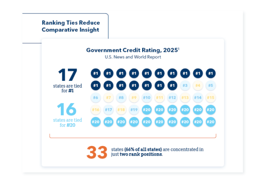
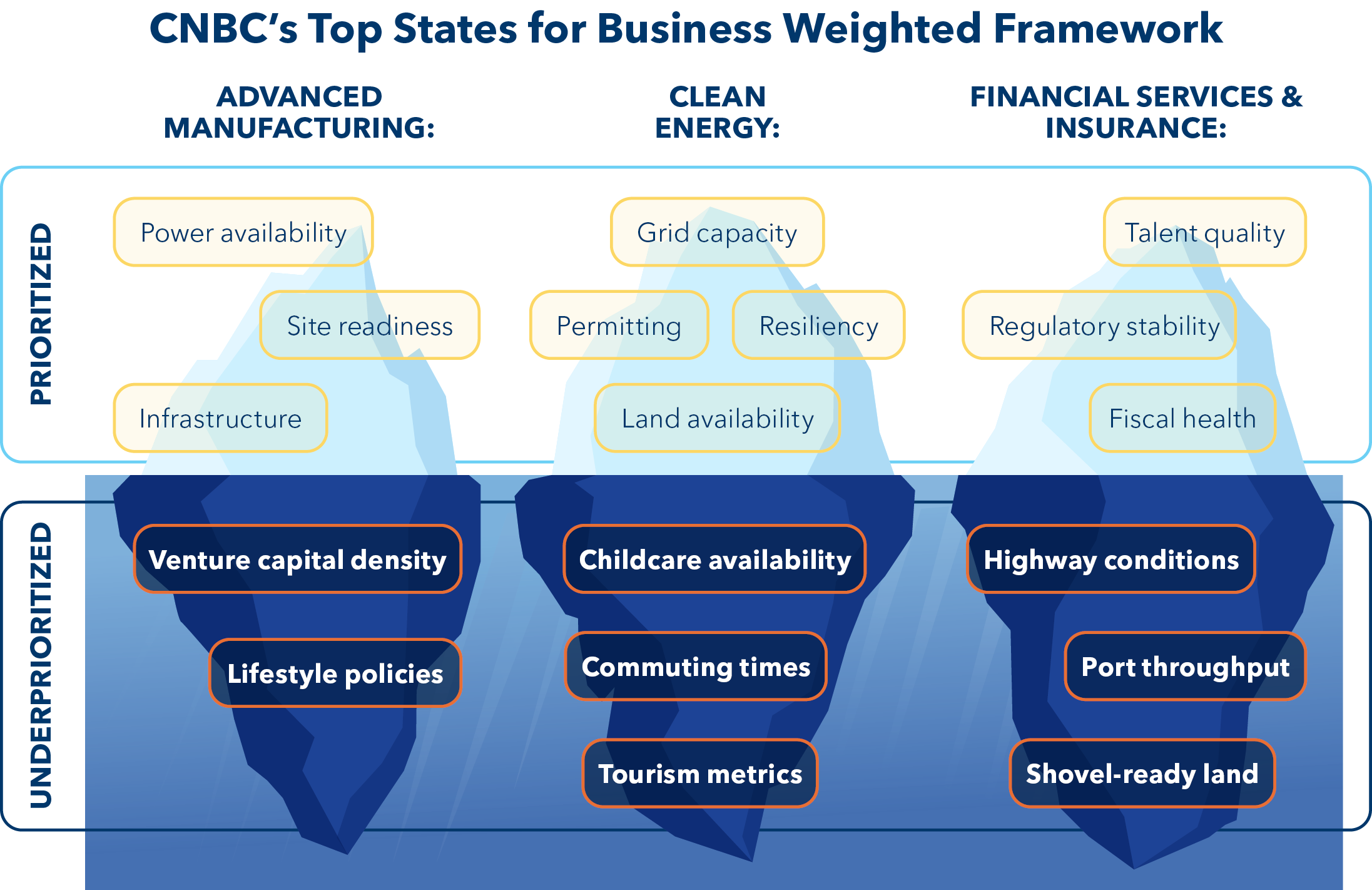
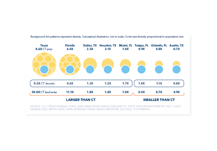
Like other reports, the document was created in partnership with the AdvanceCT Research team, who procured the data and developed content in the format of a PowerPoint deck. Following its review and completion, the deck was handed off to me for creative direction and design treatment.
Development
I had the pleasure of working with a Marketing teammate who served as my design support on this project. I delegated page layouts to him with specifically curated references gathered from our previous reports, new pages I designed, and outside design inspiration I had compiled. Together, we were able to turn the 29-page report around in less than two weeks, including review, revision, and publication.
Execution
Deck Revamp
Having last been updated in 2023, our master decks needed a fresh look. The AdvanceCT brand has evolved over time, and its materials needed to reflect that. The suite of deck templates is comprised of twelve different decks, ranging from nine to 95 slides within each. They are used to present industry-relevant value proposition, custom research, data-driven reports and more.
Overview
Discovery
This project took many turns despite the expected trajectory: what I anticipated to turn into pitch decks took the form of leave-behinds (based on the request of our business development team), a PowerPoint extension I pilot tested with a group ended up not being the right fit, and the timeline was extended as we realized that in addition to restyling 300 slides, we had to reorganize and compress all of them.
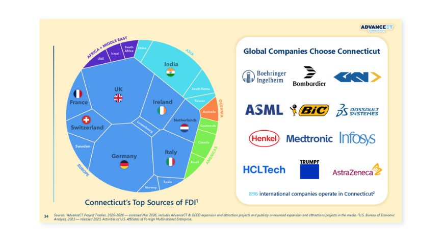
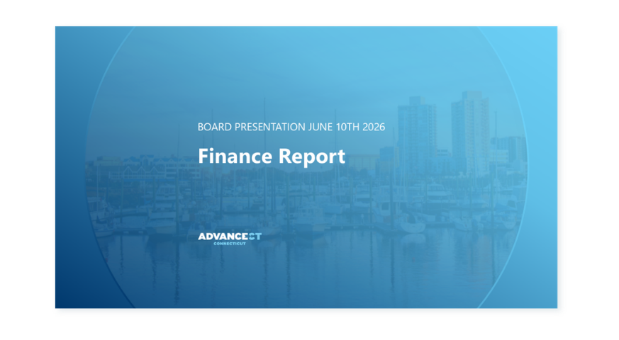

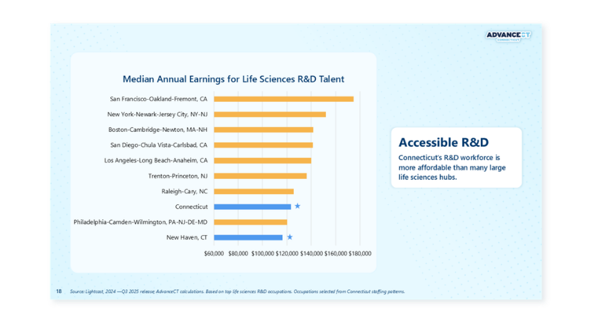

I began by creating layouts based on our most commonly recurring structures of content, then made bespoke slides for more layered information. To get the slides past the finish line, I directed two Marketing teammates to apply my revamped templates to a unit of decks that I divvied up between us.
Development
Despite "building the plane as we flew it", the decks came out vibrant, more compelling and easier to read. The slides expand on a previous palette of stark navy and white with calmer tints of our brand light blue and yellow, helping them look more dynamic and better delineate information.
Execution